CAFE BRASIL
BRAND IDENTITY AND PACKAGING DESIGN
Cafe Brasil is a staple in the Santa Cruz community.
Here is an excerpt from the website: “Breakfast and all dishes are delicious from traditional Brazilian recipes with some Californian and Santa Cruz touches, the atmosphere is warm, alive, laid back, as if being in a restaurant or home in Rio de Janeiro, Bahia or another cozy Brazilian place - always with the Santa Cruz culture! We put a lot of effort and care in providing such a friendly, relaxed and happy ambiance because that 's a fundamental part of what Brazilian culture is about.”
SOFTWARE USED: PHOTOSHOP | ILLUSTRATOR
BRAND SYSTEM
TYPOGRAPHY
ILLUSTRATIVE ELEMENTS
COLOR PALETTE
design process
-
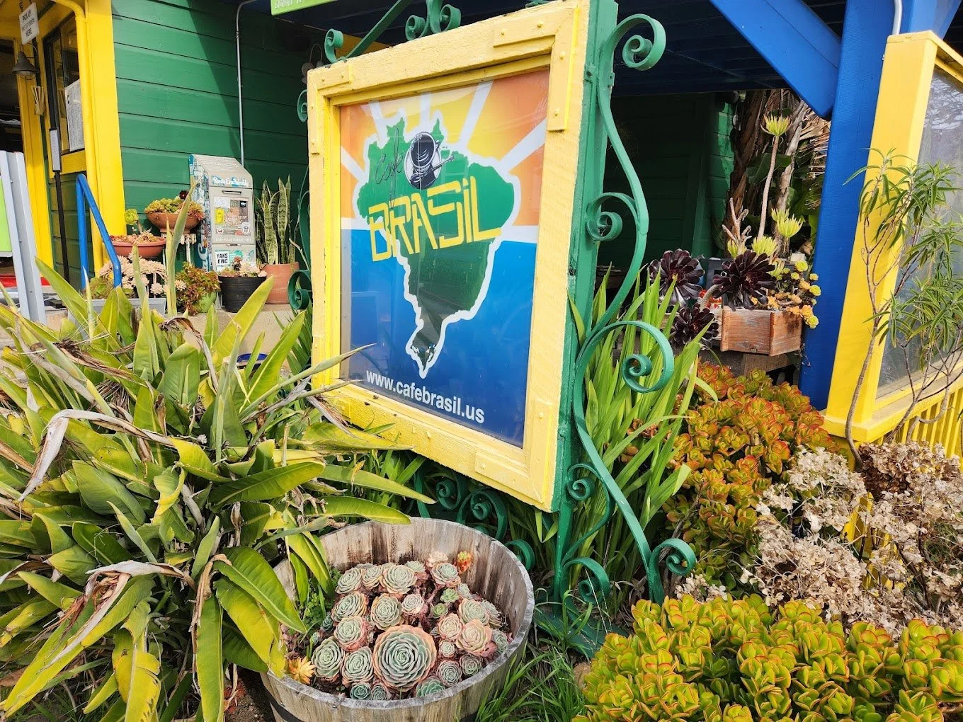
Description text goes hereThe exterior and interior of the building use the colors of the Brazilian flag (green, yellow, and blue) so I wanted to use pictures of the restaurant to help find a color palette. I used the Adobe Color Wheel to extract colors from images of the restaurant and selected various colors from different images to use as a brand color palette.
-
The original logo was a bit complex so I wanted to try and create some simplistic illustrative elements to incorporate. I looked for imagery of traditional Brazilian patterns to use as inspiration. I found an image of blue and white patterned tiles that I thought would be good to use. I used Adobe Illustrator to recreate the center illustration on the tile and ended up breaking down elements from it to use as a logo mark and illustrative elements.
-
I went through different type options until I found a display type that I thought would work well with the illustrations and colors and effectively represented the feeling of the restaurant. I then found a secondary type to use with the primary time for subheadings and body text.
logo variations
BLACK AND WHITE version
MAIN LOGO
CIRCLE / LOGO MARK
RECTANGLE
FULL COLOR version
MAIN LOGO
CIRCLE / LOGO MARK
RECTANGLE
SIGN REDESIGN
ORIGINAL
REDESIGN


